l is for letters
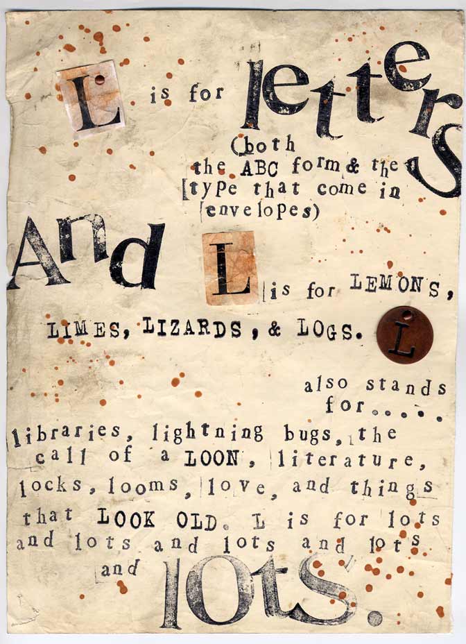
I remember rather distinctly my first experience with letterpress type. It was during my "2D Foundation Class"...one of the first of my many art classes in college. As was typical for me, I was nervous to enter the printmaking building - afraid of what unknown tasks and techniques, materials and tools awaited me there. And yet, the moment I started stamping the old, metal letters, I was hooked. The raw quality, the link to the past, and the immediacy of the results drew me in with little convincing.
I thought about this entry at many points over the unplanned, month-long blogging sabbatical that I somehow took during most of August. As I traveled to Arizona and back, enjoyed August's warmth, and also dealt with the unexpected difficulties of this summer, I still had the letter L stuck somewhere in the back of my brain. I pondered over the various "L words" that inspired me in one form or another. And even though it's taken over a month to get this latest piece finished and posted, I am convinced that these breaks are necessary for creative rejuvenation. I now find myself ready and eager to dive into the second half of this alphabet.

Comments